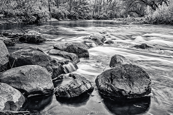
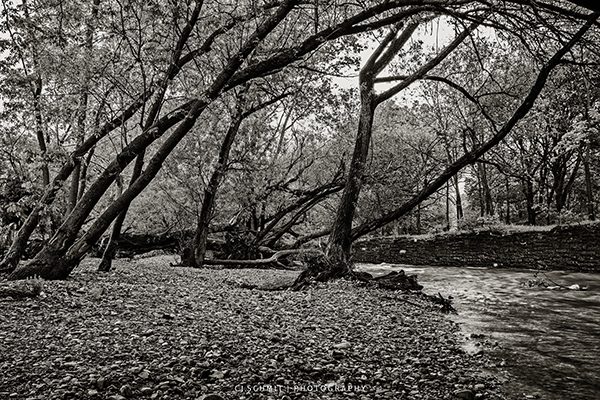
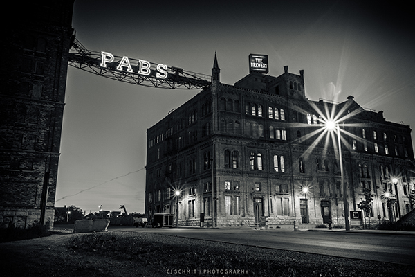
Color… most of us see this everyday and everywhere we look. It’s a very important thing for some us and others just take it for granted. Obviously I deal with color a lot in my photography but I also love my monochrome as anyone who follows me will know very well. One thing I am asked by many people is how do I decide what photo will be color and which will be monochrome. That answer is a bit more simple than some might think.

Color can be a very powerful thing, it’s candy for our eyes a lot of times and that is what draws our attention to things around us. If color wasn’t that way with us, everything would be left black or white. Now this is not saying that black and white are any less important, I am just stating that color has its place and a very good one at that. There are times where color just doesn’t do much or even takes away from a situation. Recently a fellow photographer, Tom Baker from Toronto, Ontario Canada shared a photo that he had taken. He wasn’t entirely happy with the photo, partially because of the composition so I suggested to him to try it in Monochrome. Personally I thought it was a great photo but my initial instinct in seeing the photo was that the color wasn’t really adding anything to the image. There was nothing bright in the photo and nothing that needed to be emphasized with color in order to stand out either. There were lots of details though that would benefit from a nice monochrome processing. Here is where my decision making lies, let me explain more.
Color is a wonderful thing, it can change our moods very easily, it can even express feelings without a word being spoken but there are times it makes things fall flat. Depending on the time of day you are shooting or the weather conditions, the light you work with could just make those colors wash out and look plain flat and stale. Sure, you can use tools in Photoshop or Lightroom to boost those colors back up but even then there are scenes that are just better off without color. My rule of thumb is, if color doesn’t add anything to the image then go monochrome. Color is the “magic” in a lot of work and that is the key I work with. If there is no “magic” , then process for monochrome.

Now just because the color isn’t making that image pop or adding any magic, doesn’t mean the color is worthless. This is where I let a few of my secrets out of my bag, well not secrets to all. I am sure there are plenty out there who know this but I also know a lot that don’t know about this. Making monochrome images that grab people’s attention rely on the color they were taken in. You need to process the color before you go to monochrome.
I know a lot of people that like to use the settings in their camera to process the photo for B&W and then only do minor corrections on it in post processing. There is nothing wrong with that but if you want to take your work to the next level, work with RAW and process your photos for monochrome in Lightroom or Photoshop. You have much more control over your work that way and can make some changes that you really can’t in the camera. The biggest thing to making your work stand out is process your work as you would with any color photo. Do your color corrections and make those colors come alive. This translates into better contrasts once you convert to B&W and is the key to making the work pop even in B&W or toned work. Sometimes, depending on the photo, it’s even good to push the colors a bit more over the edge then you would with a color photo. Push the contrasts a bit and make the color a bit over the top, not a lot, just a touch. Too much and things will start to look fake and pushed even in the monochrome image. One other trick I use is to push the sharpness of an image a bit. This brings things a bit more to life but don’t go too far with this otherwise you’ll create halo’s and other nasty things that will make your image fall apart.
Once I have my image set in color, I bring it into Nik Silver Efex Pro 2 and take the image to the next level. I have a few different presets I like to use depending on the image I am working on but the one that gets used the most is #5 High Structure (Harsh). I don’t use it “as is” I end up tweaking it a bit with a bit more contrast and even more structure than the default uses. I also like to push the Highlights setting all the way to the right to reduce the highlights a bit in most of my work. From there I’ll sometimes use one of the color filters depending on the mood of the piece I am working on and from there I have a few custom tones I like to use if the photo calls for it. Over all this is my big key to making my work stand out a bit more from the other work around it.

Hopefully this article has given you a bit more insight into making monochrome work and stand out from the others around you. It is something that takes time and patience but eventually you will find a “formula” that works for you in your post processing of your work. Monochrome doesn’t have to be boring or sad, you can make it live and breathe just like the color work does with the right process.
Note:: I want to clear up one thing in regards to monochrome. In my last article about working with monochrome, someone brought it up that monochrome is different than B&W. Their point was that monochrome means one color and therefore monochrome was different than B&W. The dictionary states that Monochrome work is also B&W work and my point with using Monochrome in my last article was that I do tone a lot of my B&W work so monochrome fit well to cover both B&W and toned work. If one wants to get really technical, Black is considered the “Absence of color” where as white is the “blending of colors” and therefore is the one color in a B&W photo. I am not trying to be a jerk about this, just explaining why I use the world monochrome rather than B&W. Monochrome covers a bit more area then just saying B&W
–
CJ Schmit is a 38 Year old self-taught photographer specializing in Monochrome Landscape and Architectural photography.
I enjoyed your article. The only thing that I would add is that B&W photography seems to help the viewer focus on the composition of a print. At least in my opinion.
Good point Tom and thanks 🙂
Thank you for a wonderful tutorial! I was aware of the different effects achieved by tweaking the individual color channels for a B/W image, but It had never occurred to me to manipulate the colors PRIOR to transforming to monochrome.
What a great tip – can’t wait to experiment!
🙂
You are very welcome, I am glad you found it helpful 🙂
Thanks for this. I just got the Nik SEF2 and looking forward to using it. I was curious about PP in color first. Do you find that generally gives a better result than shooting B&W film and scanning into Lightroom? Or is B&W film still better than digital plus PP?