Photography exhibits can be a daunting and challenging concept for the amateur photographer. You find yourself with a great series of photos that people apparently want to see but the challenge you face is selecting which of the one hundred photos in the set make to the top twenty five to go on show.
Well having recently found myself in this predicament I decided to opt for a slightly different approach to honing down a photo series and finding the most relevant shots to exhibit, I have entitled it ‘the Moo Card approach’.
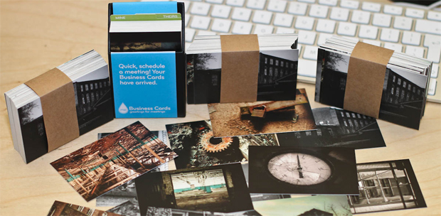
I was able to reduce the selection down to fifty photographs that I then had printed in the form of Moo Business cards, I had two hundred cards printed (4 x 50 cards) as there is a sizeable discount for the larger print run.

The Process
This might sound like a lot of work but it actually couldn’t be easier. I had most of the photos in my flickr account to begin with (each being 1200 pixels wide). The Moo website can automatically pull your images from flickr and better still lets you select photos from an individual photo set.
I planned a two fold purpose for the cards. Firstly I want to make them available during the exhibition as a token gift to each visitor with the added benefit that the URL of my website was neatly printed on the back. Secondly the cards are going to play a major role in the process of deciding which photos are going to make it to the show.
March and April are the market research months. Each time I have 3-4 people together I provide them with a ‘deck’ of Moo Cards and ask them to select their ten favourite from the set and also the five they least liked.

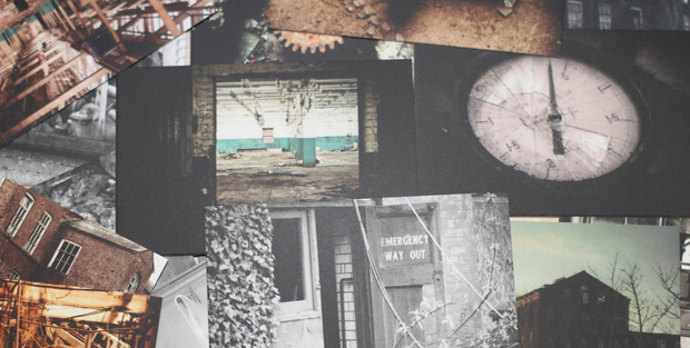
Despite being only business card in size the print quality is stunning so my market research guinea pigs are able to make accurate judgements on each photo.
The cards are robust and I am making sure they are well looked after so that if and when the show takes place I can purchase a cheap desk stand of the photo cards for visitors to take away as a little marketing memento.
So far I have been able to disregard five photos from the set that won’t make it to final print. Even without an exhibition in mind the fact you can print 50 individual business cards each featuring a completely different photography means you pretty much have a mini exhibit of your work everywhere you go.
If I get the final go-ahead for the exhibition next week expect a Moo postcard invite sometime soon ! I’d love to hear your opinion and experiences in using Moos cards and any tips if you have had your work exhibited in the past.
Interesting way to do it, although I’d find that problematic: moo’s business cards are a very letterbox aspect-ratio, and my favoured style is square! Even if you’re a uniform 3:2-head, you’ll be asking people to compare apples and bananas.
(I do use Moo-cards, though; have a box of 100 of the things to be distributing, all happily advertising my websites and stuff.)
This is a really interesting post. We’re just about to start talking to design and photography students about their work actually, as end of year degree shows will be coming up soon. This is a great way to get instant feedback on the work you’re thinking of showing.
Good luck with the exhibition!
(Tim – it looks like these are MOO Business Cards – not the MiniCards. They’re a much closer shape to the final piece I would imagine – much more like the size of a standard Business Card or a traditional uncropped photo).
Great idea – throwing the deck out for people to rate! I imagine a lot of people may find 50 quite a lot to sort through, but the speed must illicit pretty gut responses.
I second the quality of the Moo cards. I have a pack of the minicards, and think they look excellent.
I might try this technique soon as I really need to put a portfolio together (how many years have I been saying this?)
It seems a reasonable axis to consider in determining one’s portfolio. When it came to creating my site, I used a combination of flickr (sets for what’s made it to Explore, photos I’ve considered my favourites as I go along, my photostream organized by “Interesting”-ness descending), redbubble (stuff that’s sold), some emergent themes I discovered in the process, and various other metrics. It expands the audience available to help you determine what’s what, that’s no bad thing.
I like your barbours moo cards recognised them right away.
Thanks @Irishmanlost they look far better in real life. I just hope the show actually happens. Have a meeting on Thursday.