Hello!
My name is Daniel Camer and I’m a Toronto Photographer who mostly shoots people. I suppose if you wanted to, you could label me a Commercial Photographer.
In this article I’ll be sharing with you a little bit about my workflow and how I operate. First let’s quickly cover the beginning of my process.
Before a shoot even happens, it’s important to get all the information. Where, when, who, what, how, etc. I need to know where and when and who I’m even shooting so that I can scout the location in advance to be aware of lighting conditions and how that affects my subject.
Next up, I ask myself what kind of lenses I’ll need. Do I need to throw out the background? Grab a telephoto. Or perhaps the background is an integral part of the image. Grab a wide lens.
With regards to the camera, always have a backup, even on non-paid shoots for portfolio work—there’s an entire team who’s counting on your camera working correctly so that their efforts are not wasted.
Once at the shoot I try to set aside some time to meet and greet everyone on set so that everyone is feeling as excited as I appear to be, although in reality I’m usually a nervous wreck. Being the sole person responsible for the success of the shoot, I’m always solving problems whether technical or production related—it’s exhausting.
After the shoot wraps, I always make backups of the photos. For big important shoots I bring a laptop and a portable hard drive for live backups as the images are shot.
Let’s now focus more on My look: how do I achieve the specific look to my images?
Rule #1. I break all the rules. I over sharpen in post. I don’t use custom white balance. I try to capture moments, not poses.
Let’s start off with my process. I use Lightroom to import my photos with custom metadata tagging and a custom preset which I developed to pre-sharpen, correct for distortions, etc.
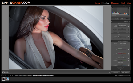
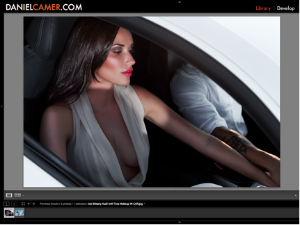
Let’s take this photo here as an example of a photo we’d be working on (the photo is already retouched in Photoshop for skin blemishes and imperfections but yet to be color/tone/exposure corrected).

So here we have an image of Brittany Diamond, who looked ever so wonderful alongside Joseph Ng, with makeup provided by Tess Osgood.
What I’m not liking is how this image is lacking contrast—the dark tones are not dark enough, and this may be due to my flash having been used as the fill light with the sunset being the key light.
First I’m going to go ahead and use curves to bring the darks in a bit. Next up I’ll be sharpening the image with a mask so that only the strongest edges are sharpened. Then I’ll be pushing my clarity slider slightly over to the right for the strongest possible presence, without over-doing it.
At this point, the color of her skin is still a bit light, so I will go into the HSL menu and bring down the Luminance of the color orange. Once I am satisfied with the darkness of her skin, I must adjust the saturation as well because the luminance slider tends to saturate when moved. Now all I’d like to do is make her lips pop a bit more, so I’ll increase the saturation for the red channel ever so slightly.
The most treasured aspect of my workflow is adjusting the skin color separately from the rest of the image.
Sometimes this becomes problematic if there is more information in the orange channel outside of just the skin, in which case the image must be duplicated, and the original must be imported into Photoshop in addition to a copy in which the skin is the desired color. The other information in the orange channel can now simply be masked out while preserving the desired skin tones.

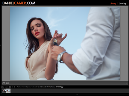
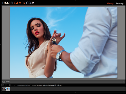
Let me show you another example from the same shoot in which I added a pop to the skin tone and contrasted that up against the sky, which had a very dull color to it when I shot it due to the fact that I was shooting using natural light without reflectors or any sort of modifiers.
Here is the original, which is lacking lens corrections for distortion and vignetting, curves adjustment, sharpness, clarity, saturation, and tones, for starters. Once again, this image has already been retouched in Photoshop for skin blemishes and such, but not yet color corrected.
The before picture:

And now after sliding the blue Luminosity slider down towards the darker levels and adding saturation to the blue channel we have more of a blue color pop. Further, I have darkened the orange channel as well and slightly reduced the saturation so that our beautiful model does not look like an Oompa Loompa. Adding some clarity and sharpening, then removing the lens distortion, we have a final image that looks as follows!

Hope you enjoyed the insights into my workflow.
–
Daniel Camer is a Toronto Photographer who shoots Commercial Content.
http://www.DANIELCAMER.com
Nice article Daniel !
Thanks Andrej, I very much like your work! I’m expanding into photographing weddings in Toronto and I’m excited to see that you have such wonderful work. You’re an inspiration!